Articles
Articles and stories on timely topics and trends across a variety of industries.
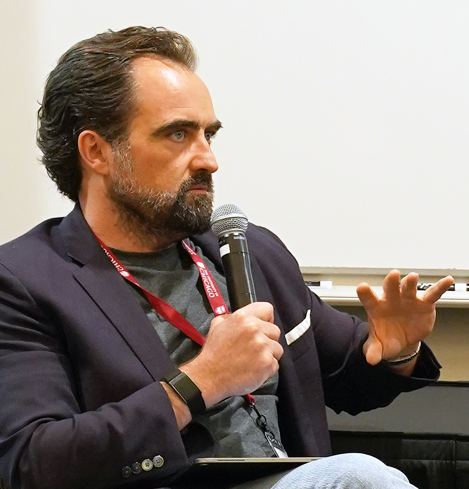
Building Confidence in the C-Suite
Dave Watrous, CCO at Axio BioPharma
Chief Revenue Officer Executive Education

Building Confidence in the C-Suite
Dave Watrous, CCO at Axio BioPharma
Read time – 5 minutes

The Investor’s Lens
Chris Trendler teaches CROs to translate what they know into a language that boards trust.
Read time – 4 minutes

Where the Gold Is
Customer experience leader Emilia D’Anzica is training CROs for a world where the sale is just the beginning of a much longer conversation.
Read time – 5 minutes

Start from the Customer
Sergio Corbo, MBA, PhD, teaches CROs to stop selling what they have and start solving what customers need.
Read time – 5 minutes

Building a Revenue Engine
How one CRO applied program frameworks in real time and kept her company profitable while competitors scrambled.
Read time – 6 minutes

Medical Writing for Every Audience
Anu Bangaley, certificates in Clinical Trials Management and Regulatory Writing*
Read time – 4 minutes

Training Medical Writers for a Field in Motion
Fast-changing fields need training that keeps pace.
Read time – 6 minutes
A Systems Approach to Revenue Leadership
For veteran CRO Dan Frailey, great Chief Revenue Officers don’t follow the playbook—they write one tailored to their specific company, customers, and product. That’s how they create competitive advantage.
Read time – 6 minutes

Leadership Unscripted
The Second City improv techniques protecting brands in crisis.
Read time – 6 minutes

Connecting Science with Compliance
Morayo Adebiyi-Uchendu, PhD, Regulatory Writing
Read time – 4 minutes